
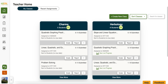
As part of our ongoing commitment to providing an intuitive and accessible experience, we’re pleased to announce an update to Edcite’s teacher interface!
What’s New?
The major change you’ll notice is in our navigation layout. While the menu options and overall functionality have remained unchanged, we’ve repositioned the navigation from the top of the screen to a sleek, side-aligned menu. This adjustment offers more space at the top of the screen for content, improving readability and reducing visual clutter.
We’ve also updated the colors and design on pages to ensure that Edcite is up to date with digital best practices and evolving accessibility standards. We want to make sure that Edcite is accessible for all educators and their students.
What’s the Same?
Edcite’s powerful features and functionality are all still available, they are just presented in a refreshed and more streamlined manner. This update is all about improving how you interact with the platform without altering the core tools that support your assessment and analytics needs.
Why the Change?
We’re always looking for ways to enhance our platform and make your experience as smooth as possible. By moving the navigation to the side, we’re providing a more spacious and organized workspace, allowing you to focus on what matters most—delivering exceptional educational content and responding to students’ needs.
Get Started!
To explore the new design, simply log into your Edcite account! We’re excited for you to experience Edcite’s new look and feel! As always, we value your feedback and are here to support you through this transition. Feel free to reach out to our support team with any questions or concerns at support@edcite.com.
Leave a Reply